1. Color wheel definitions
Explore the color wheel at https://www.canva.com/colors/color-wheel/ and define the following using writing for the web techniques discussed earlier:
- Complementary colors
- Two colors that are on opposite sides of the color wheel.
- High contrast, high impact
- Monochromatic
- Three shades, tones, and tints of a single base color.
- Subtle, harmonious
- Analogous
- Three colors which are side-by-side on the color wheel.
- Best used with one dominant color
- Triadic
- Three evenly-spaced colors on the color wheel.
- Bold, vibrant; more versatile than two complementary colors
- Tetradic
- Four evenly-spaced colors on the color wheel.
- More difficult to balance with more colors, so let one be dominant
- Primary, secondary, tertiary colors
- The RGB color wheel is concerned with the way colors work in terms of light.
- The RYB color wheel is concerned with the way colors work in terms of material/pigment.
- Primary:
- RGB: Red, green blue
- RYB: Red, yellow, blue
- Secondary
- RGB: Cyan, magenta, yellow
- RYB: Purple, orange, green
- Tertiary:
- RGB: Orange, chartreuse green, spring green, azure, violet, rose
- RYB: Red-orange, yellow-orange, yellow-green, blue-green, blue-violet, red-violet
- Warm colors
- Range from red through yellow and bring to mind warmth, like the sun.
- Like cool colors, this is a way of describing color temperature. The temperature can evoke certain feelings or imagery.
- Shades, tints, tones
- Created by adding black, grey, or white to a base hue.
- Shades:
- Created by adding black, darkening the color into something rich and deep.
- Can be dramatic
- Tints:
- Created by adding white, lightening the color and making it less intense.
- Can help balance hues alongside vivid colors
- Tones:
- Created by adding grey, which results in subtler versions of the original color.
- Less pastel than tints, can bring out added color complexity
- Hue, saturation, luminance
- Hue:
- Essentially any color on the color wheel. Saturation and luminance are two ways of making adjustments to a hue.
- Saturation:
- The intensity, or purity, of a color.
- Luminance:
- The amount of brightness, or light, in a color.
- Hue:
2. Favorite color
Pick your favorite color. Identify complementary colors, monochromatic, analogous and triadic colors of your favorite color. Write down the hexadecimal numbers or take screenshots if needed.
Many of my favorite colors belong among blues and greens, and one of those is seafoam, which in this case I will represent with the hex code:
#8DDCDC
Complementary: #8DDCDC + #DC8D8D

Monochromatic: #8DDCDC + #66D0D0

Analogous: #8DDCDC + #8DB4DC + #8DDCB4

Triadic: #8DDCDC + #DC8DDC + #DCDC8D

3-5. Paletton questions
3. Visit http://paletton.com to learn about color pallets. Identify three color pallets that you like the most. Choose one monochromatic, adjacent and triad colors.
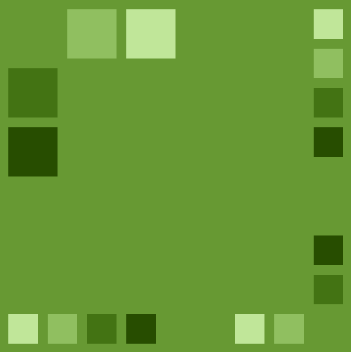
Monochromatic
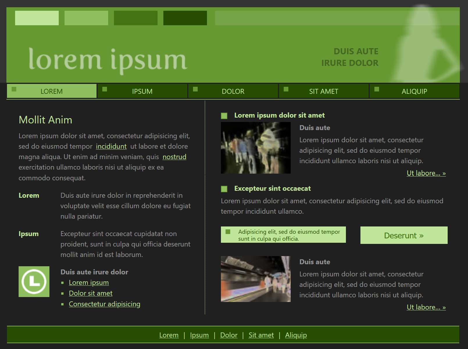
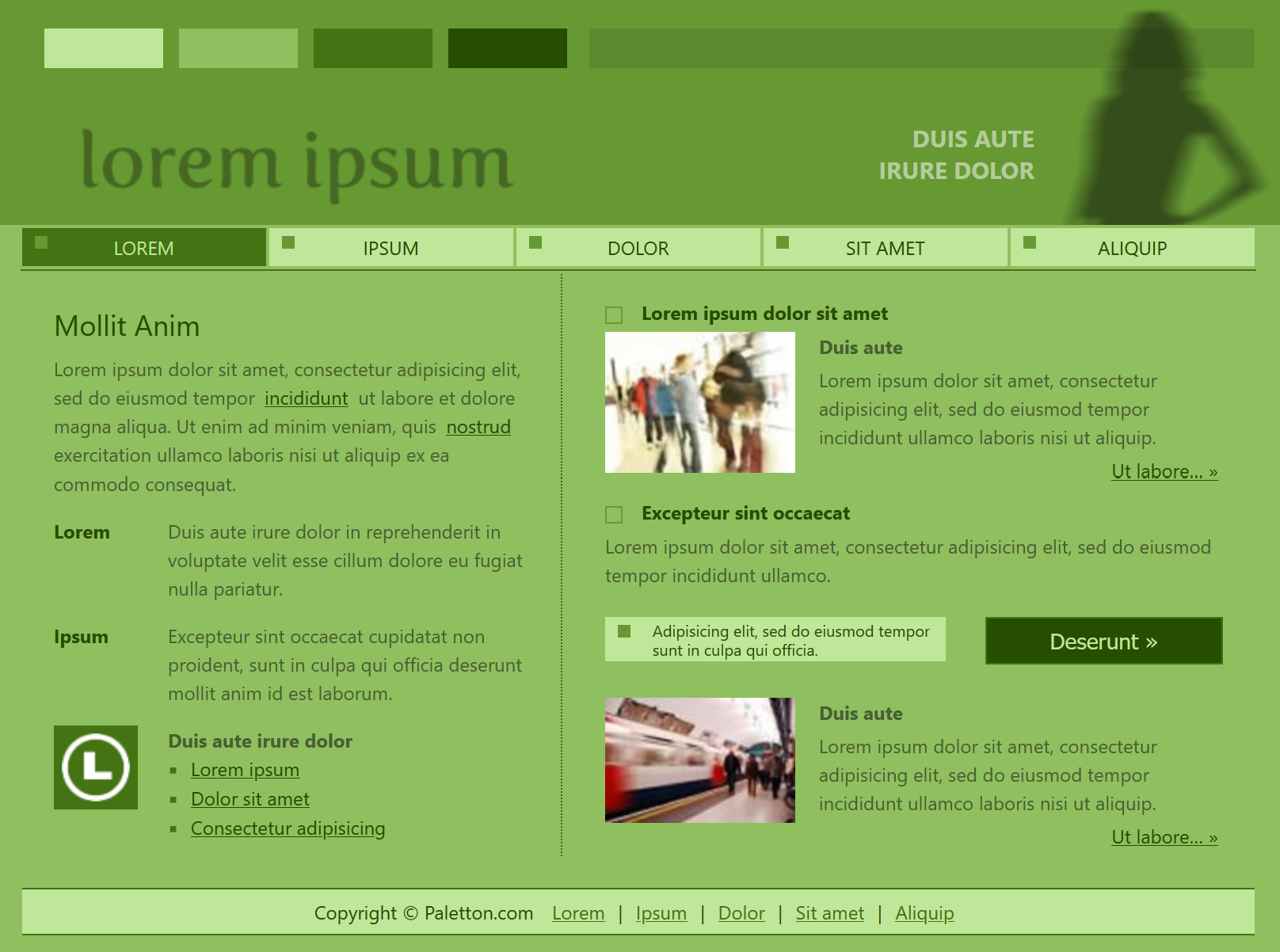
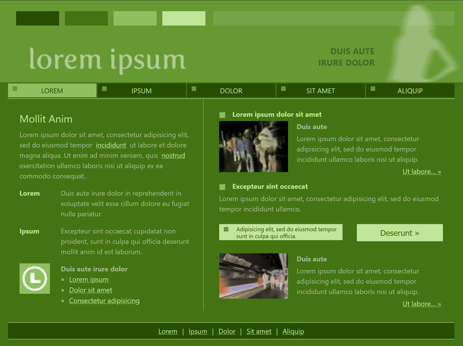
Base color #679933
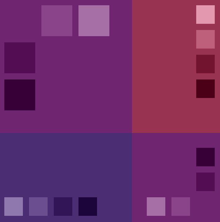
Adjacent
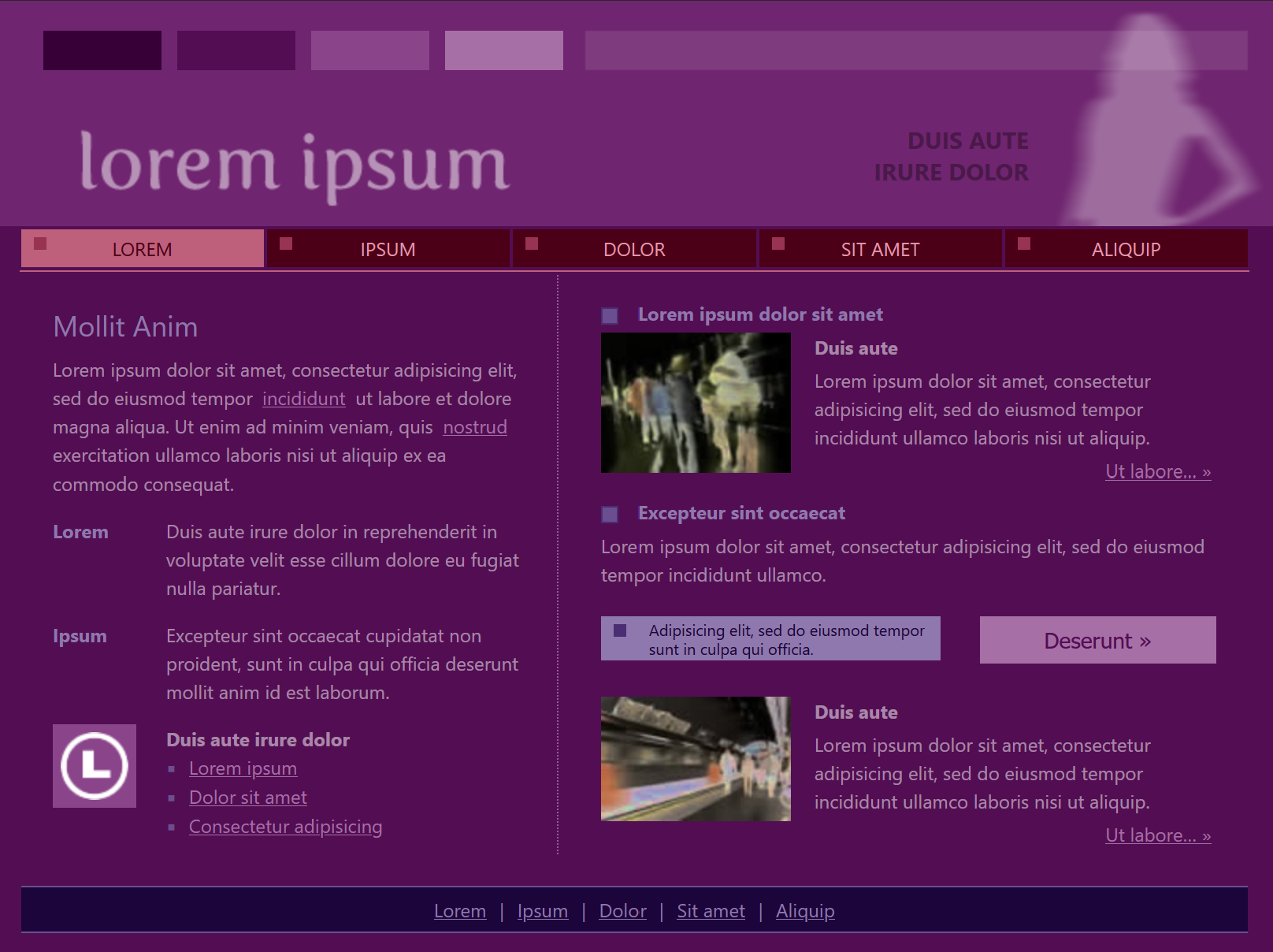
Base color #6F256F
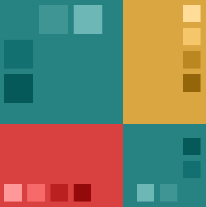
Triad
Base color #278282
4. Apply the chosen color pallets to web pages. […] Write down a few color choice and text combinations you liked. […] Write a paragraph or two describing your Paletton color choice experience.
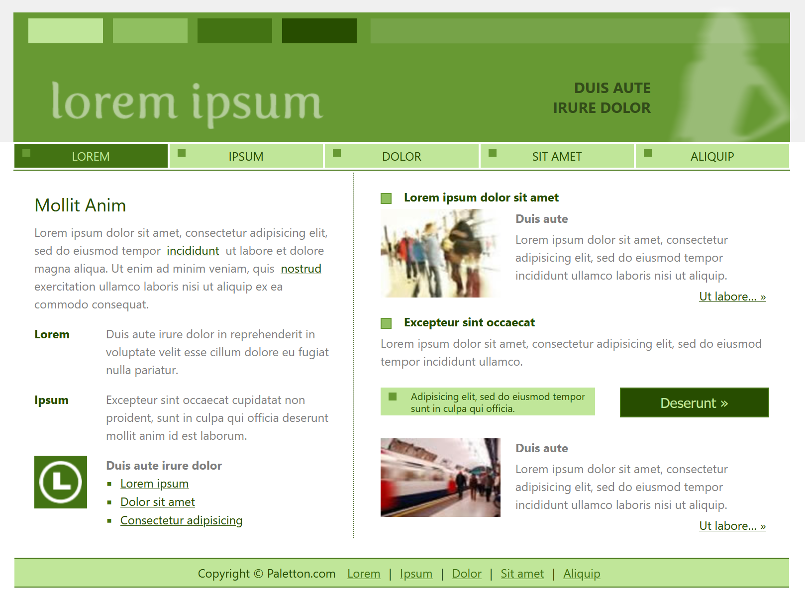
Monochromatic — #679933
The white page version of this pallet looks like it could be utilized for a health-conscious business, especially one using natural materials in some way. Being sensitive to light colors, I prefer the dark and negative layouts — the latter seems like it would be good for a nature education page.
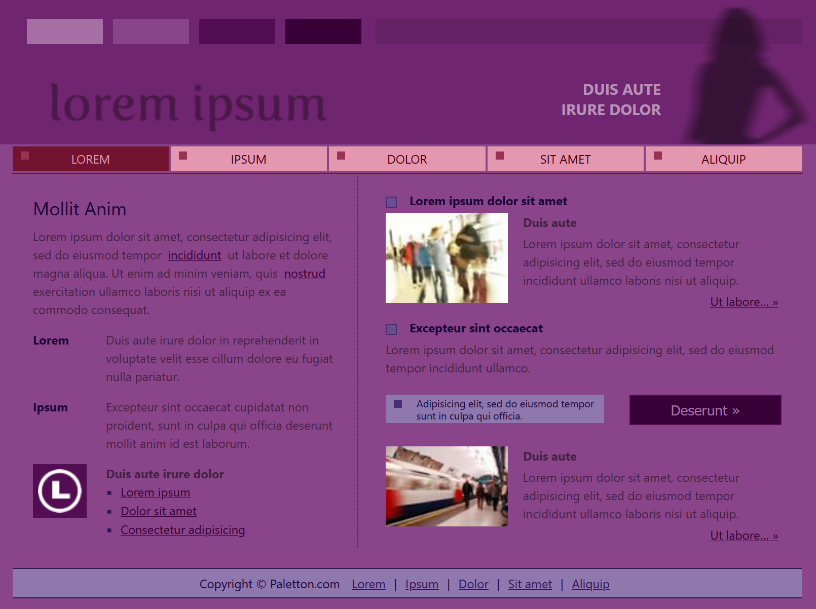
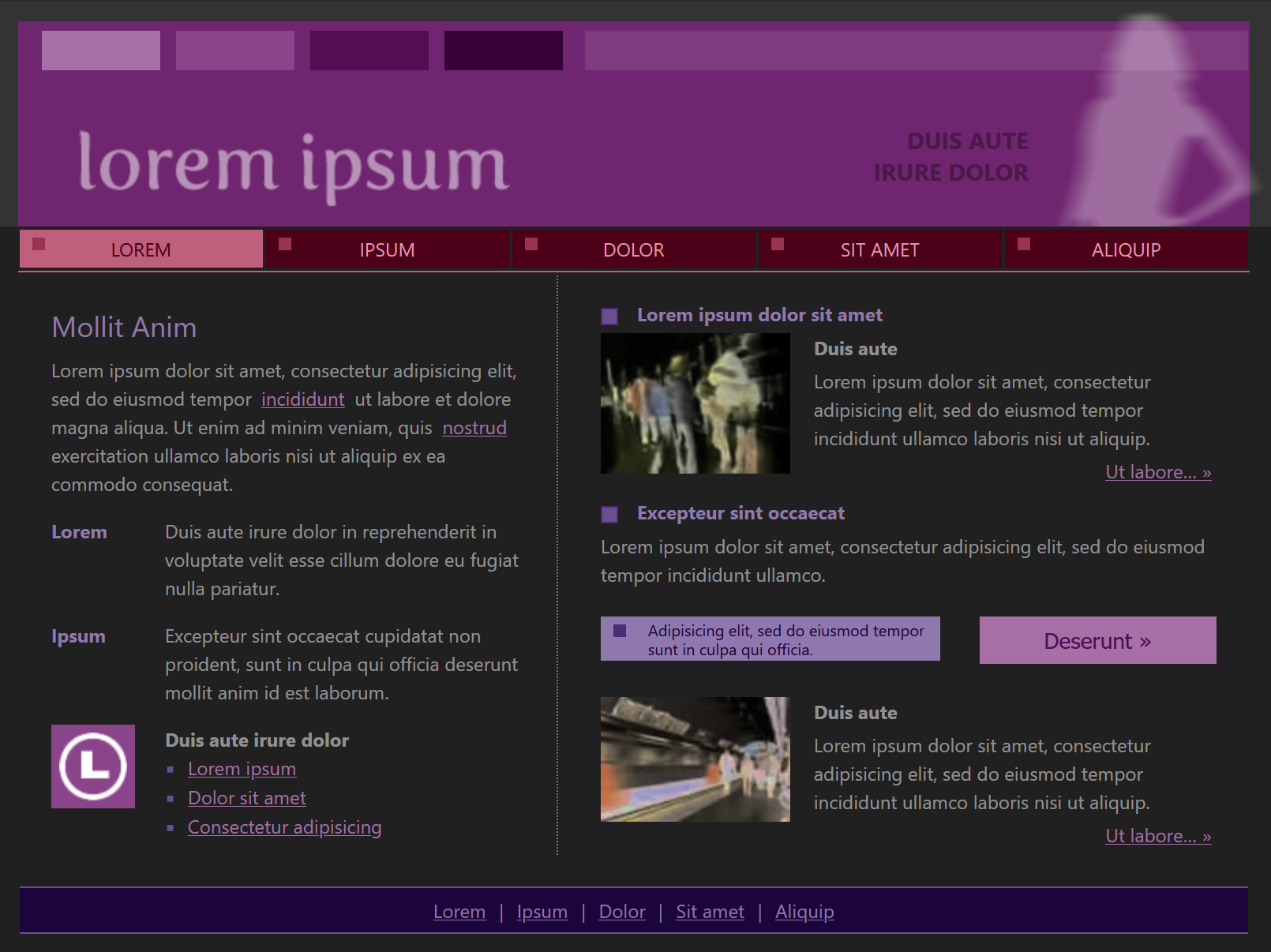
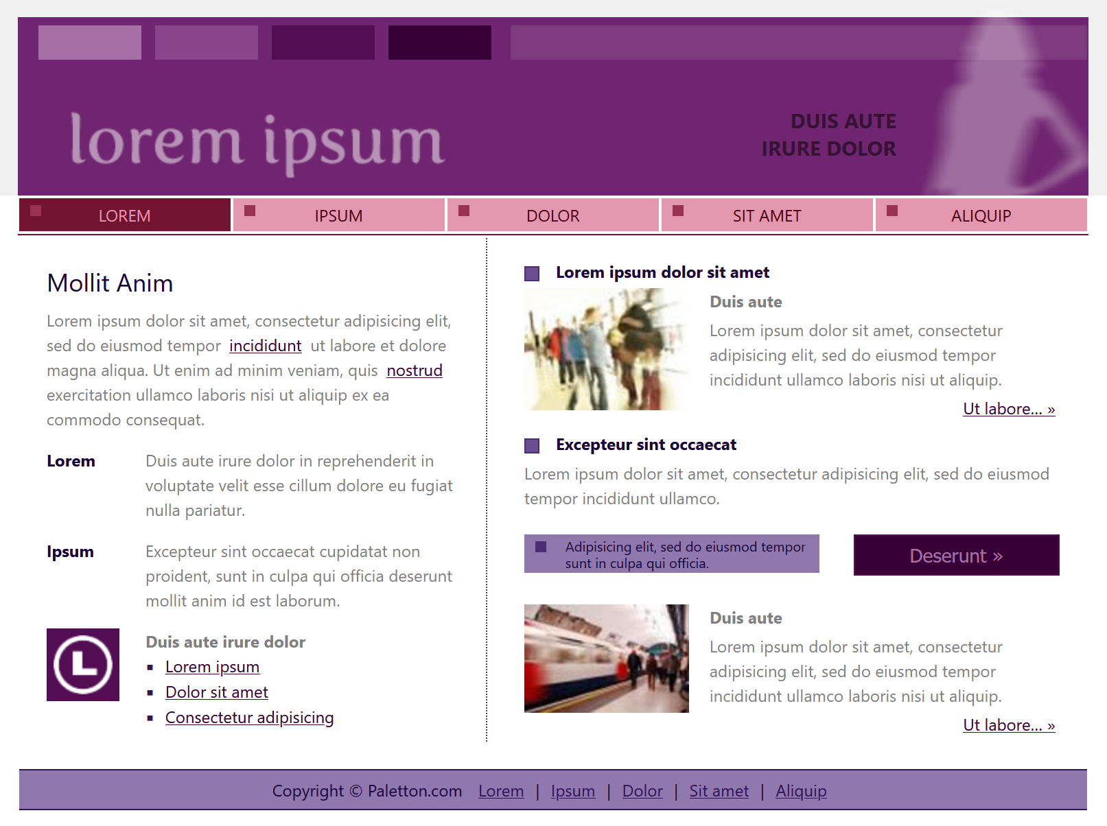
Adjacent — #6F256F
The white and dark pages of this pallet seem the most effective to me, and whatever the purpose, the goal would likely be to stand out since this doesn’t seem like an especially common combination. I don’t love the positive version, but it brings to mind yoga and other mindfulness practice. The dark version could be the website for a nightlife venue, but not a high-energy one — more of a relaxed experience.
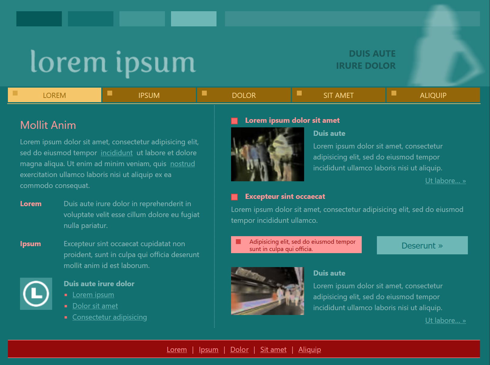
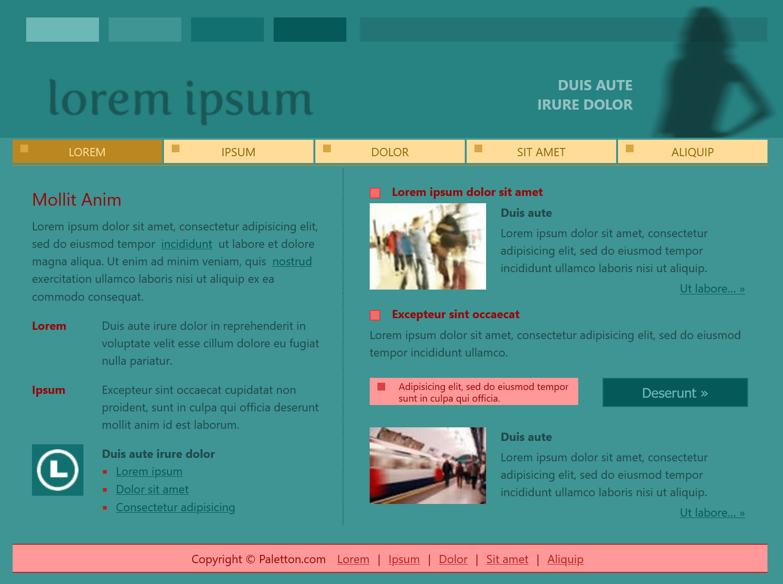
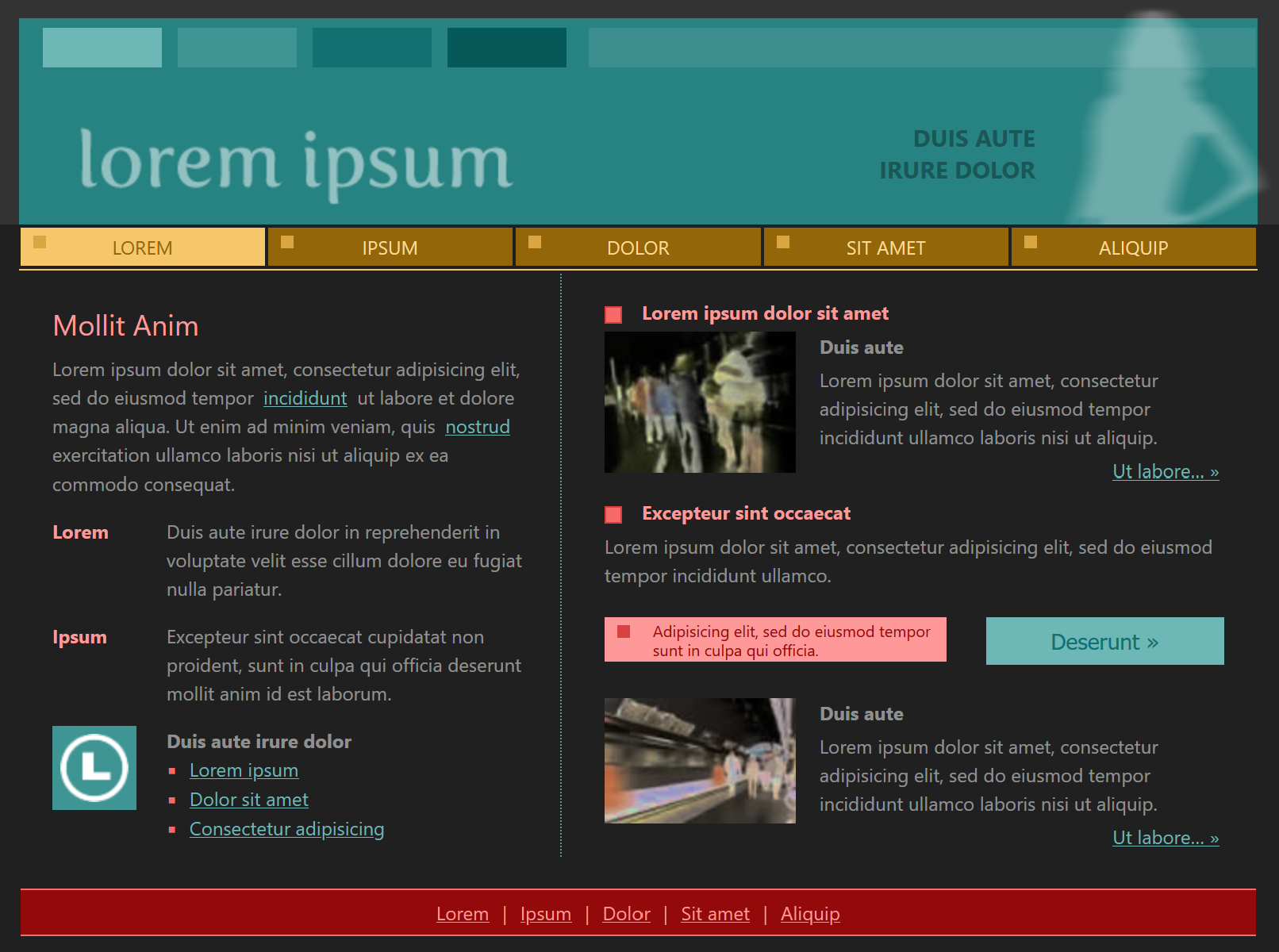
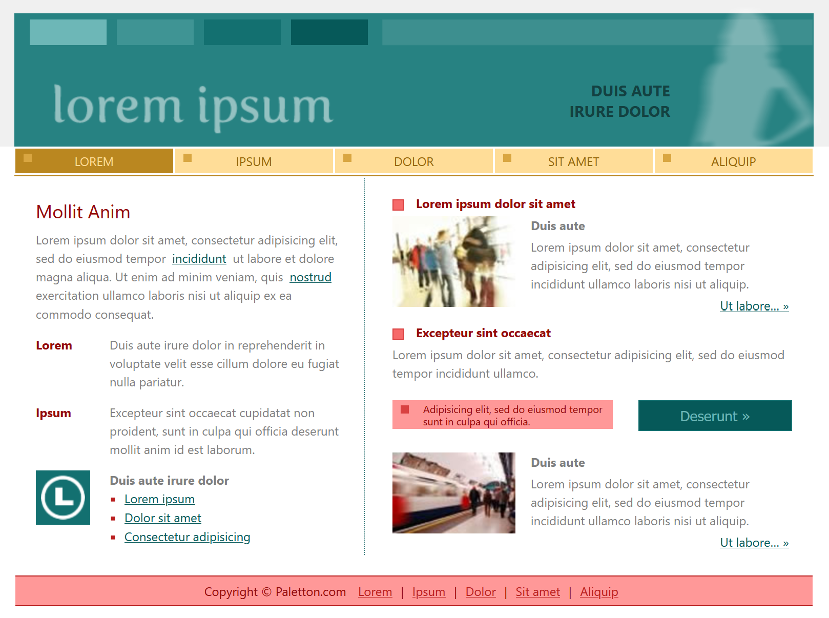
Triad — #278282
The white layout makes me think of educational websites, like math. I think it has something to do with the RYB-like color scheme that it reminds me of grade school. The positive and negative designs could both suit a water-focused organization or business, like an aquarium.
5. Take screenshot(s) of the Page Layouts under Examples for each color palette.
Monochromatic — #679933
Adjacent — #6F256F
Triad — #278282
6. Color combinations
Visit https://www.canva.com/learn/100-color-combinations/ and identify three color combinations that you like and explain your reasons using chunking of text.
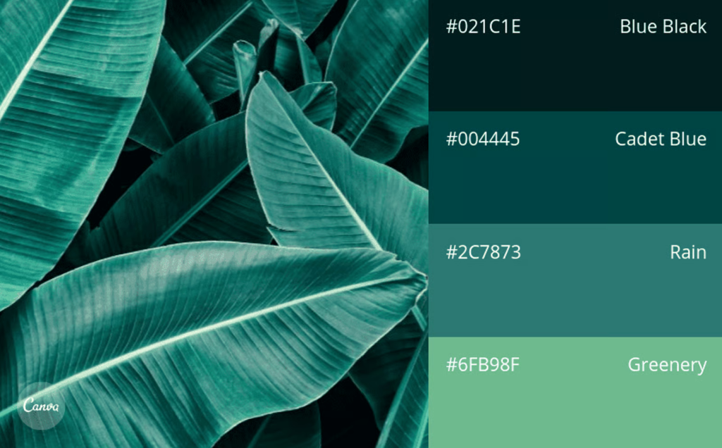
“Shady Foliage in Blue-Greens”
As usual, I lean towards cool colors.
The darkest shade is near enough to black to create suitable contrast with the lightest hue of the bunch, while the hues in between are similar without being overly monochromatic.
It’s not the most exciting color pallet, but it’s natural while being sophisticated.
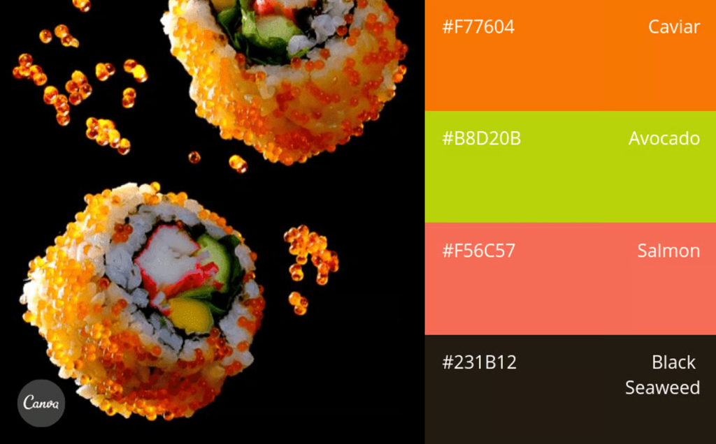
“Neon Night”
The use cases for a combination like this are limited, but it satisfies my need for a dark base without settling for samey tones.
In opposition to the first pallet, this one pops with bright colors; it’s exciting and interesting if used well.
This would certainly grab attention, but in a strange way I feel like the content has to earn this color pallet in terms of its excitement.
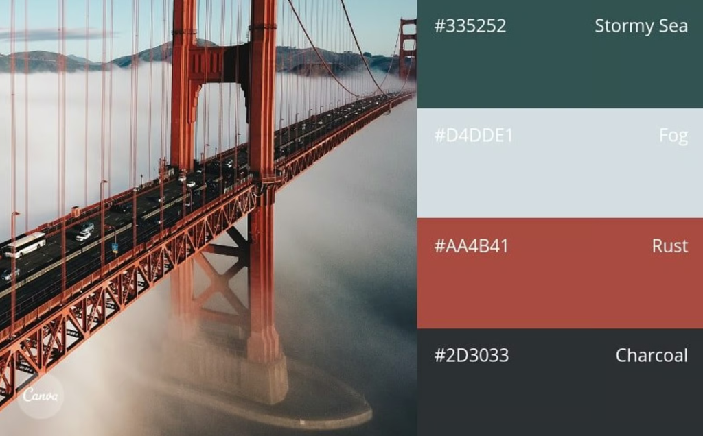
“Understated & Versatile”
I feel like the given title for this pallet covers its strengths.
The rust contrasts well with the cooler tones, providing interest without overpowering the other colors.
The photograph being of a bridge fits how I would describe this pallet — it’s a nautical-adjacent set of colors, diffused through the fog.
7. Additional resources
Find on your own two additional resources related to writing for the web, and color as a web design tool.
Writing resource: https://theuxcookbook.com/writing-for-the-web
Color resource: https://coolors.co/